Project Dreamscape
Project Dreamscape is a 3D Hack-And-Slash Roguelike made in Unity and released on Steam. Project Dreamscape was also showcased at GDC 2025. My role was as UI/UX Lead on the project.
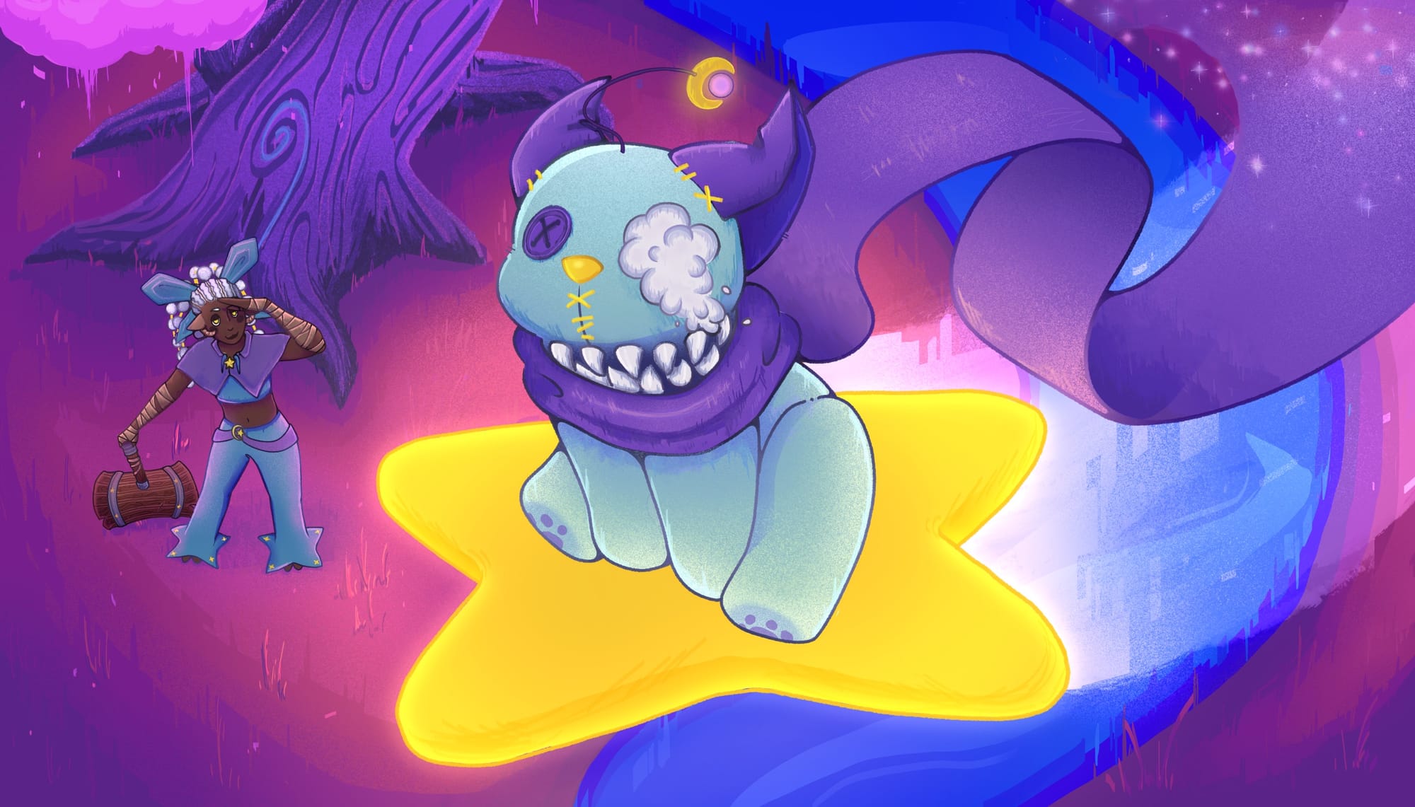
Role: UI/UX Lead
Team Size: 100
Time Frame: 8 Months
Engine: Unity
Gameplay footage from the 3/8/25 prototype build:
Prototype Gameplay Footage
GDC 2025
Project Dreamscape was showcased at GDC 2025 as apart of the New York State Pavilion.
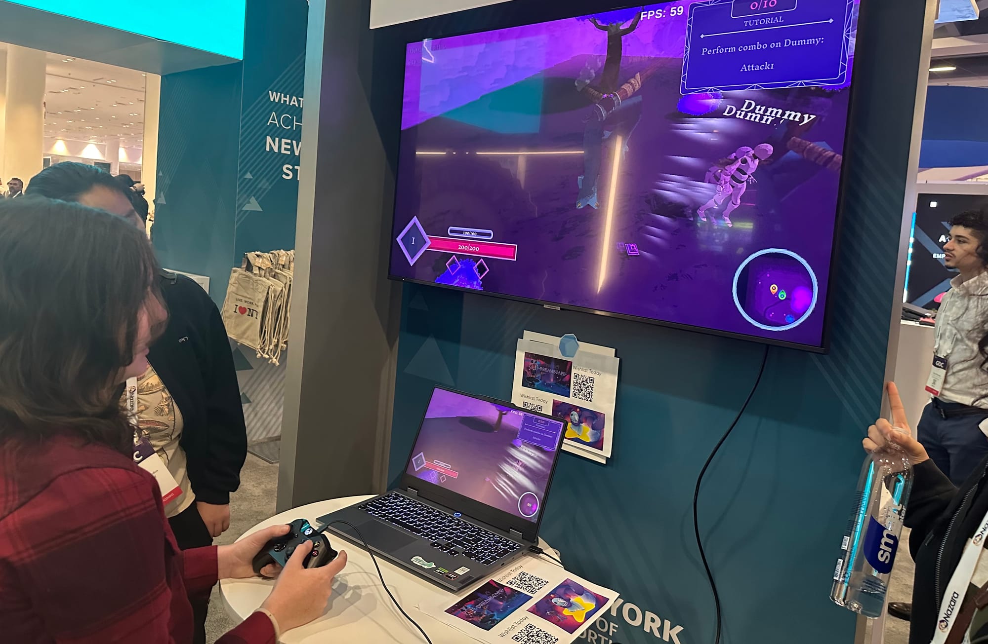
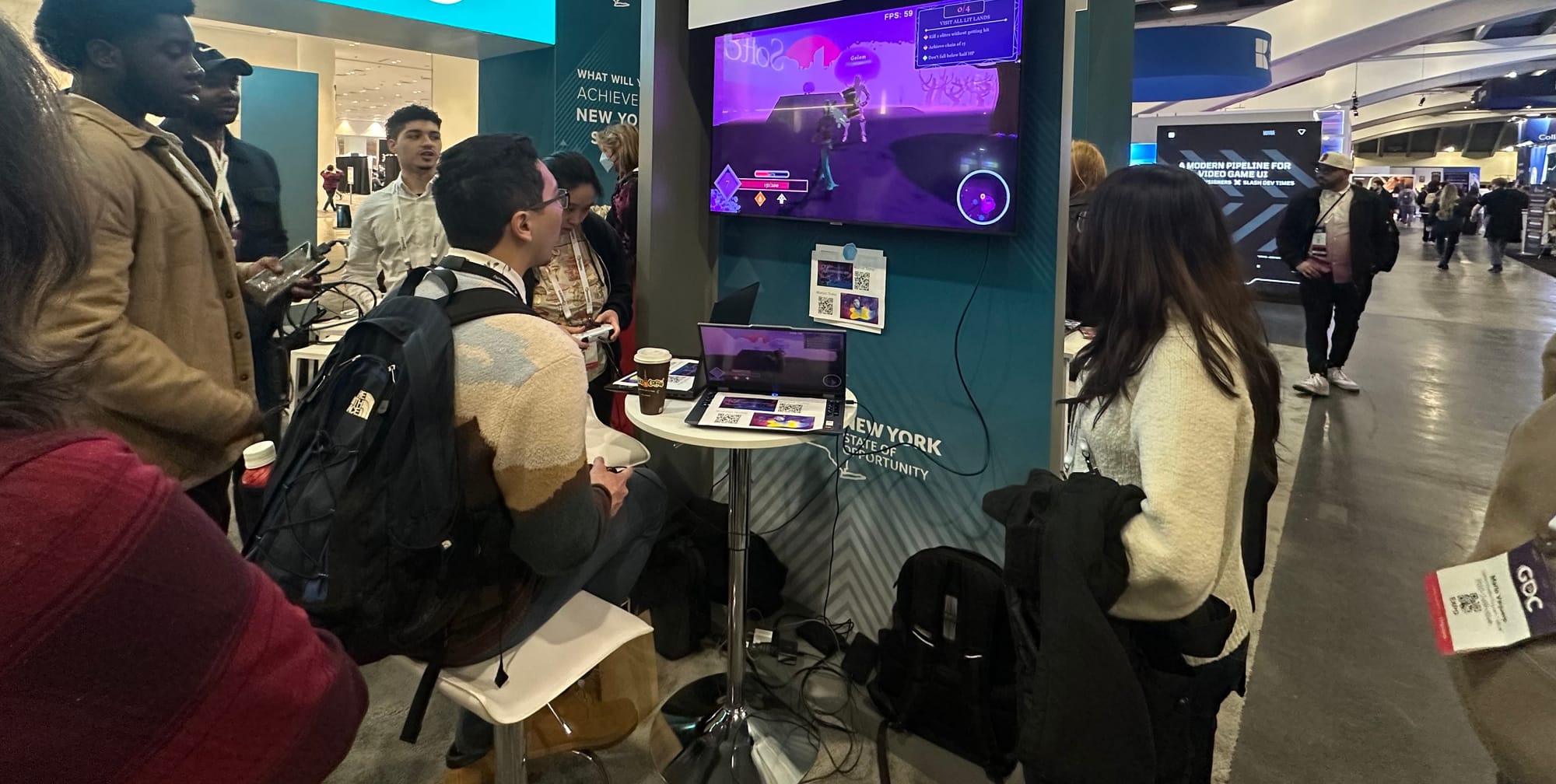
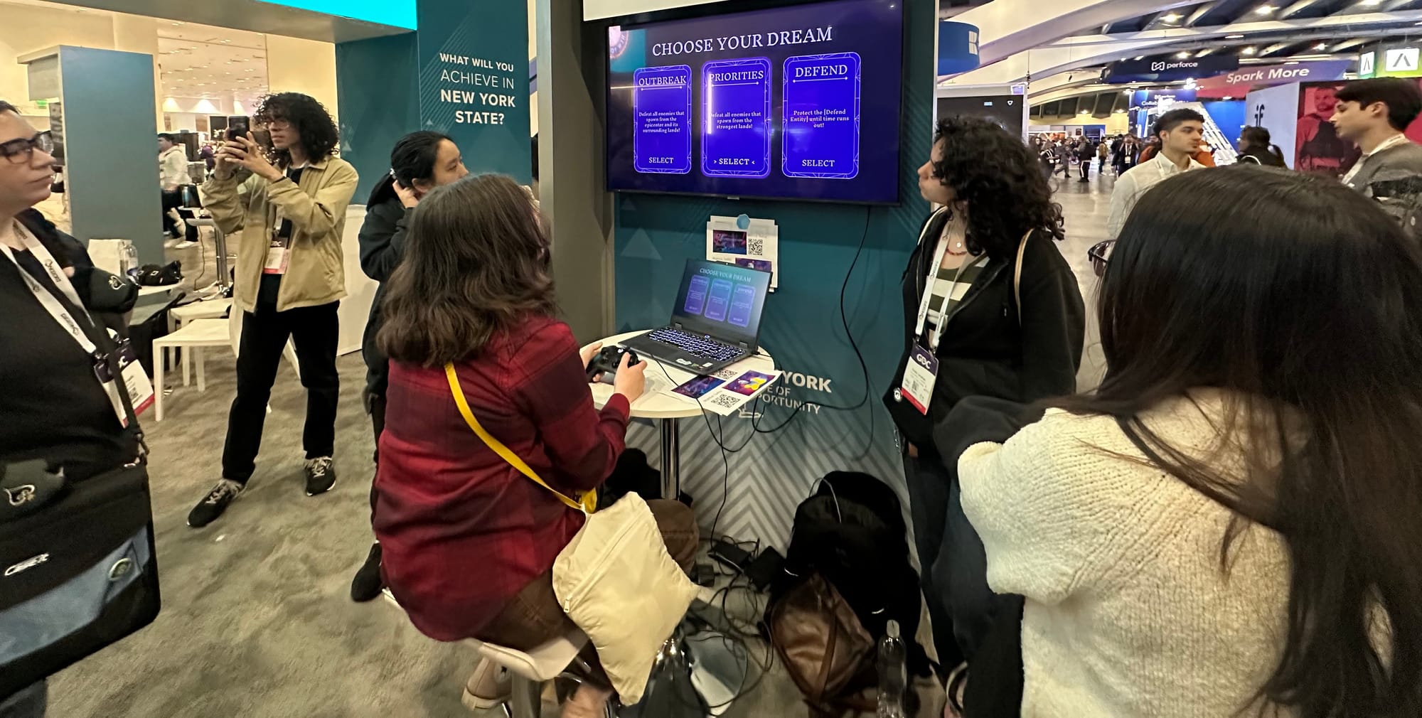
Play testers at GDC
Planning and Delegation
My first steps were to comb through the project's design document to determine everything that may need UI elements. Then, I met with our producer to compare and confirm the list was comprehensive. Following this, I moved everything into an excel sheet to categorize by what had the highest priority and segment this into potential weekly sprints. Adjustments to this were made based off of sprint reviews and updates from other design departments. This also involved ensuring that each team member's tasks were best suited to their skill set and experience, so that updates were completed as timely as possible.
After mock-ups were ready, I handled cross-department communication to ensure next steps were completed, such as art passes. This included programming, art, and animation. Additionally, I updated weekly the UI/UX section of our design document to accurate reflect the work of my team.
Style Guide
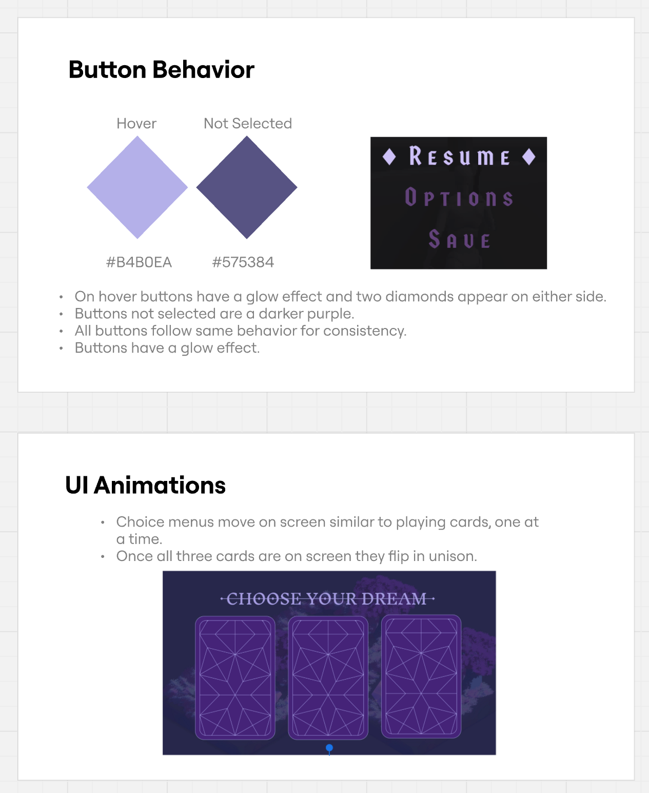
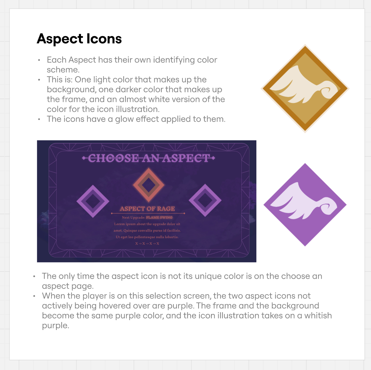
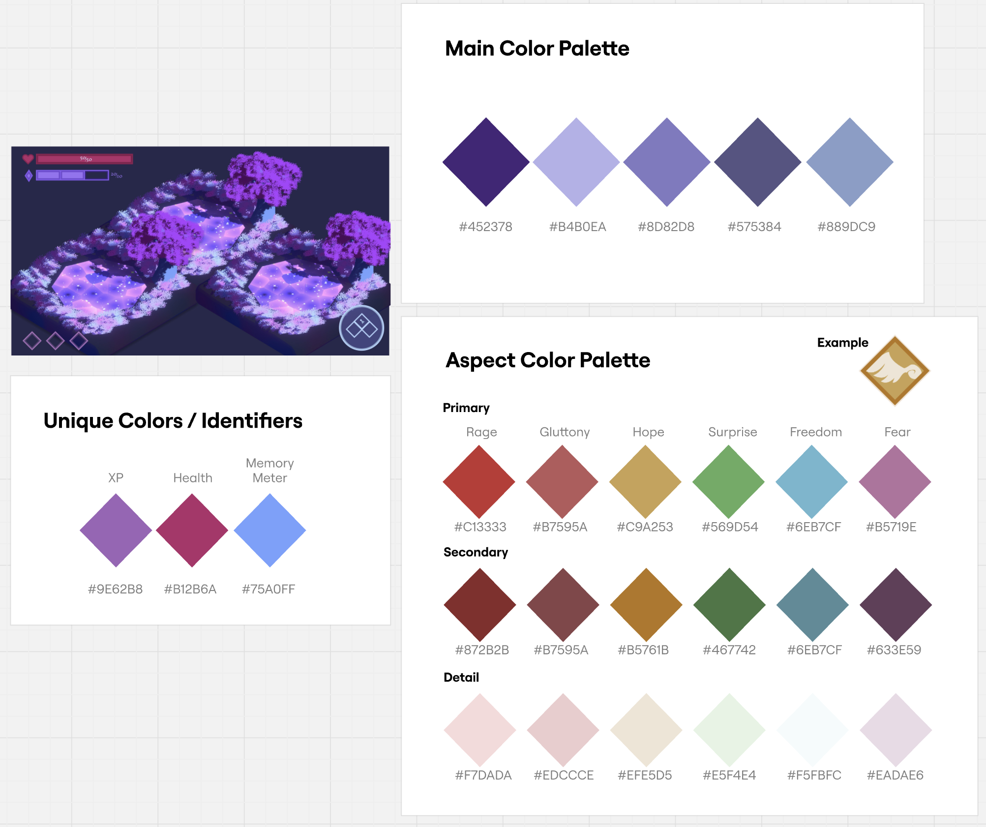
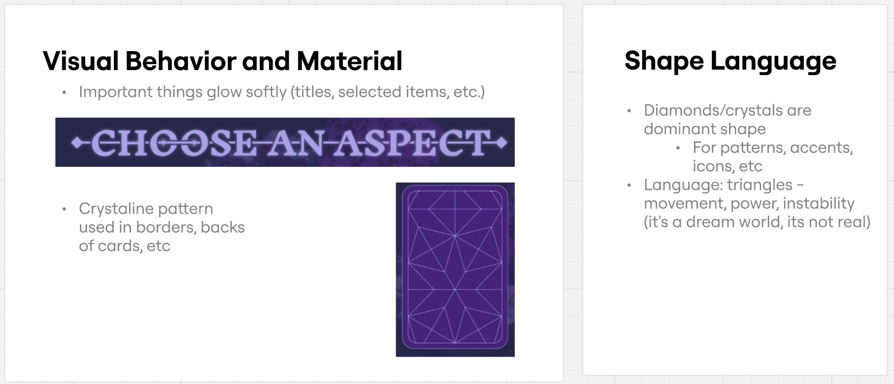
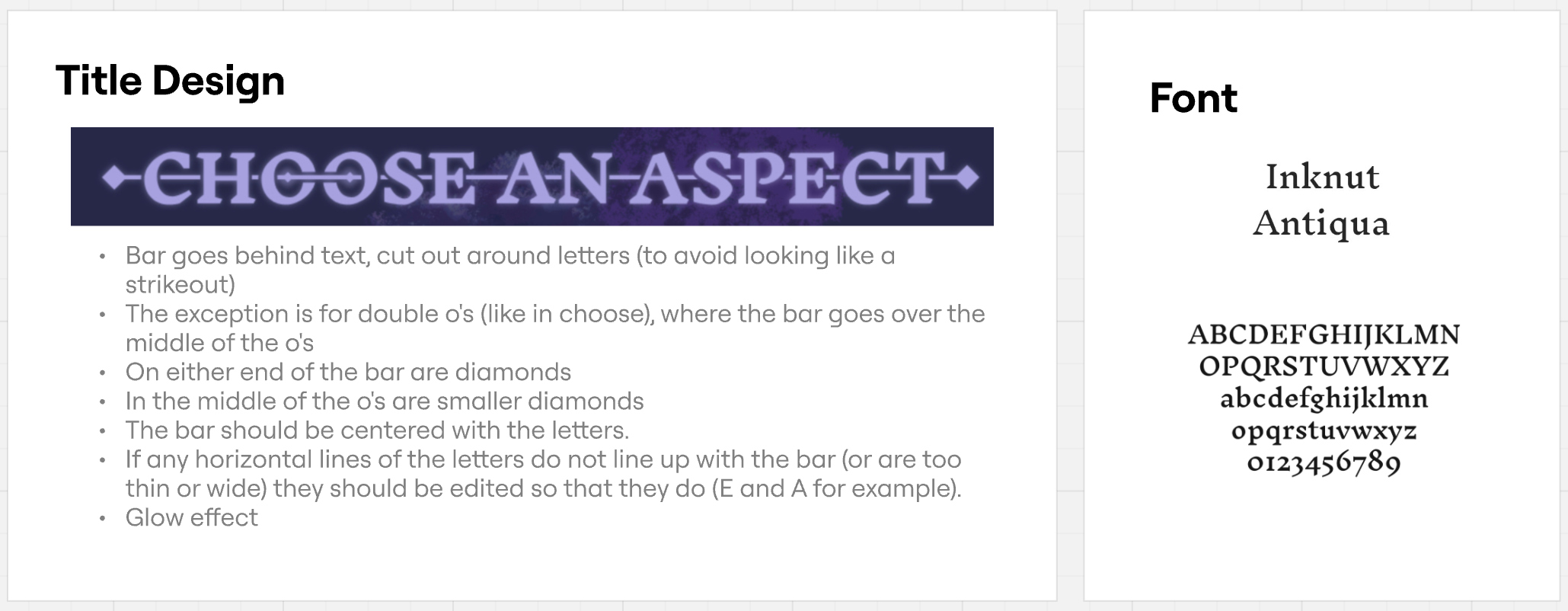
Because we were creating assets that would need an art pass, I facilitated team meetings where we would work together to create a style guide that could be easily followed by departments. Our style guide was created using Miro.
Project Dreamscape Style Guide
Mock-ups
Aspect Icons
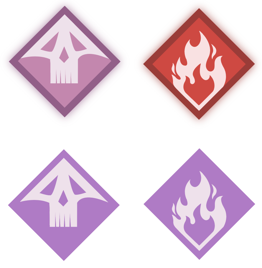
Below are examples of mock-ups I created to represent the player's selected aspects. These are Fear and Rage, both in active and inactive states. Each time the player levels up, they are given a pop-up to select a new aspect. This aspect comes with powers related to the aspect-type; for example, rage powers are more brutish. I wanted to make sure that this would reflect in the icons artwork and color.
Additionally, as reflected in the style guide, each aspect was given a unique color. This decision was made so that even when the icons were small, such as in the HUD, the player would be able to understand at a glance which power was active through color recognition.
Wave Pop-up for HUD
During the game, the player goes through different types of "waves." Each wave has a timer or quota (Example: Kill 0/3 enemies), a short description of the player's goal, and three tasks they can complete for extra tokens. The tokens can either be of the type empower or weaken.
When creating this pop-up for wave events, the goal was to convey a significant amount of information while also keeping it as easy to digest on a glance as possible. I made sure to emphasize the timer text via the red color, as this would be the most vital and consistently referenced information.
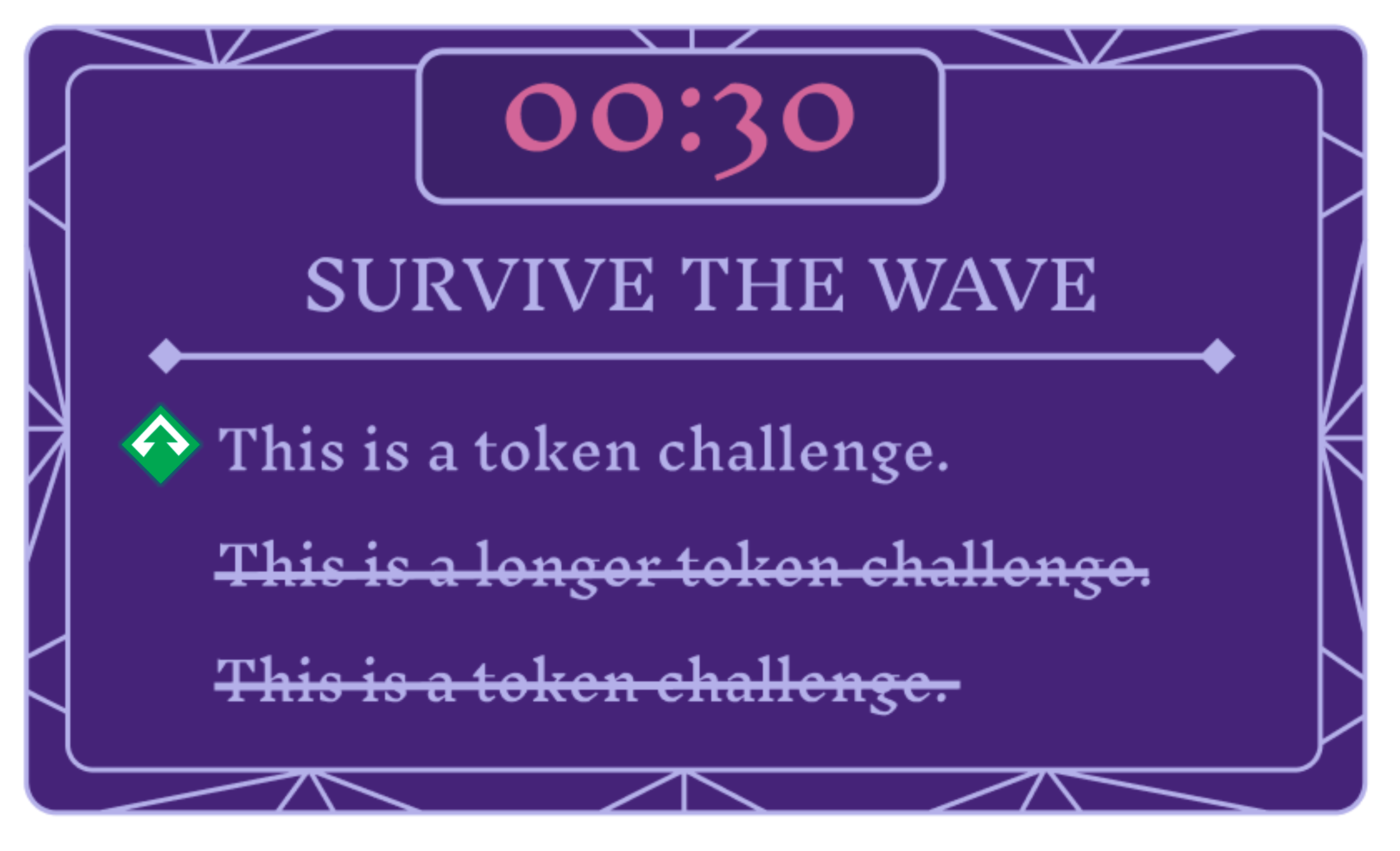
Designing the tokens were challenging, because they had to appear so small. Thus, I chose to make them simplistic, and primarily rely on color for recognition. I also chose to go for a pink for the weaken tokens, because a darker red might signify something negative despite both tokens intended to be rewards.

